[vc_row][vc_column][vc_column_text]Are you in the process of creating a new website for your business? Trying to decide upon the best colour scheme to use?
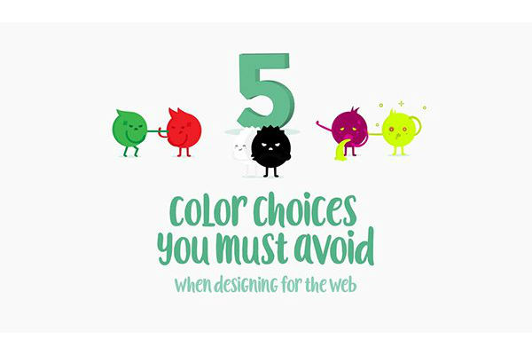
Creative Market share 5 colour choices to avoid in this infographic.
Here’s what makes their list:
- Pure black
- Red and green
- Neon colours in UI elements
- Light colours on white backgrounds
- Bright colours with more bright colours
Check out the infographic for more detail.[/vc_column_text][vc_single_image image=”742″ img_size=”full” css_animation=”appear”][/vc_column][/vc_row]
